
BALAJI KHICHIYA PAPAD
2025
Strategy, Brand Identity,
Nomenclature, Positioning,
Packaging Design,
Typography & Illustrationy
A taste of home, now packed in a box by Balaji Wafers.
Balaji Wafers, a name that echoes in every Indian home, wasn’t looking to reinvent the wheel. They wanted to honour it. Balaji has always been about bringing familiar flavours to the forefront, across age groups and occasions.
Khichiya Papad, a crunchy companion to steaming khichdi, a sidekick in thalis, a standalone snack with a squeeze of lime, has always had a quiet place in our kitchens. But in this box, it gets a louder one.
Balaji Wafers wanted to take this humble side dish and give it a front-row seat. Something that could sit proudly on shelves, look as good as it tastes, and still carry the comfort of home.
The brief was simple, but layered: Create a design that resonates with the older generation, who grew up eating it hot off the pan. And with the younger one, discovering it between meals. It had to feel grown-up without being dull. Nostalgic, but not old-fashioned. Something that could sit proudly on a modern shelf and still feel like home.


i. idea outline

ii. vector form

iii. first sketch

iv. colour blocking

v. final illustration


Kicking Off a Fun-Filled Adventure with Kixters
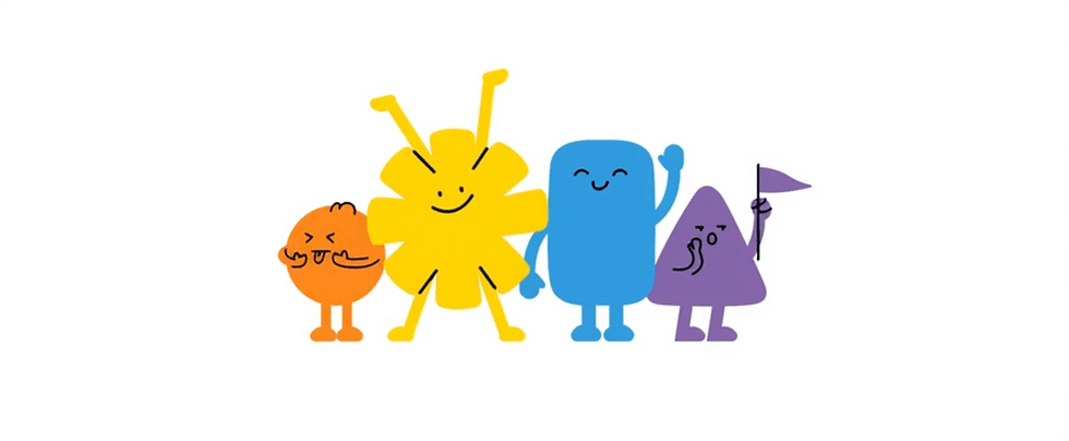
The Kixters turn snacks into toys, making every crunch a moment of playful imagination that invites kids into their mischievous world.

Brought to life by
DIB Creative Studio & Magic Bites Pvt. Ltd.
Project Credits
Concept & Creative Direction
Pankti Sheth, Chirag Trivedi, Dhavanshi Shah
Art Direction
Dhavanshi Shah
Packaging System Design
Chirag Trivedi
Project Operation & Management
Mitlesh Solanki
Founder led Collaboration
Akash Patil (Founder & Director, Magic Bites Pvt. Ltd.)
Lead Illustrator
Siddhant Jumde
Illustrator
Tanvi Kohli
Post Production
Sahil Bhojani
Add a Title
Add paragraph text. Click “Edit Text” to update the font, size and more.

Add a Title
Add paragraph text. Click “Edit Text” to update the font, size and more.

Add a Title
Add paragraph text. Click “Edit Text” to update the font, size and more.

Add a Title
Add paragraph text. Click “Edit Text” to update the font, size and more.


As the monsters evolved, we paid close attention to the
shapes and styles that kids instinctively respond to:
• Soft, rounded curves
(no sharp edges, no harsh lines)
• Big, twinkly eyes
that feel inviting and full of life
• Goofy, oversized grins
equal parts cute and chaotic
• Chunky limbs and paws
that look more huggable than scary
• And just enough mischief
to make them feel alive.


Kix Corn puffs
2022
Magic Bites Pvt. Ltd.
(Hyderabad, India)
Strategy, Nomenclature,
Identity, Packaging Design,
Illustration
And chaos never tasted this good.
When KIX came to us, they weren’t just launching another corn snack. They were launching a world. A loud, lovable, slightly unruly one where monsters crave crunch, flavors come alive, and snacking becomes a full-blown adventure.
This was Magic Bites’ first foray into creating a sub-brand from scratch aimed at a younger, hyper-visual audience. The product? Corn-based snacks packed with flavor. The challenge? Giving them a brand personality that wasn’t just functional or flavour-led, but unforgettable. A character-led packaging universe that didn’t feel borrowed from cereal boxes or comic strips. Something kids could connect with. Something parents wouldn’t mind buying again. Something that brought out the energy of snacking without screaming for attention.
They already had a product flying off the shelves. What they needed was a story. A system. A brand that could grow with every new flavor drop. One that could live on packaging, pouches, digital screens, and in the wild imagination of a 9-year-old. That’s where the Kixters came in.


