
We’re a home for ideas with heart; designing loudly, thinking deeply, and living for the goosebumps.
Because building brands that stay with people takes more than design, it takes care and craft, humans who make it matter, and a place for new voices to grow.

BALAJI KHICHIYA PAPAD
2025
Strategy, Brand Identity,
Nomenclature, Positioning,
Packaging Design,
Typography & Illustrationy
A taste of home, now packed in a box by Balaji Wafers.
Balaji Wafers, a name that echoes in every Indian home, wasn’t looking to reinvent the wheel. They wanted to honour it. Balaji has always been about bringing familiar flavours to the forefront, across age groups and occasions.
Khichiya Papad, a crunchy companion to steaming khichdi, a sidekick in thalis, a standalone snack with a squeeze of lime, has always had a quiet place in our kitchens. But in this box, it gets a louder one.
Balaji Wafers wanted to take this humble side dish and give it a front-row seat. Something that could sit proudly on shelves, look as good as it tastes, and still carry the comfort of home.
The brief was simple, but layered: Create a design that resonates with the older generation, who grew up eating it hot off the pan. And with the younger one, discovering it between meals. It had to feel grown-up without being dull. Nostalgic, but not old-fashioned. Something that could sit proudly on a modern shelf and still feel like home.


Mini Cones ain’t just
a cream treat ,
it’s a tiny burst of
happiness,
wrapped in fun.


Because every little cone
deserves a big reaction
smiles, giggles, and
a dance
of satisfaction.

mini Cones
2024
Africa Chips Mali
(Mali, Africa)
Packaging Design, Illustration
Sweetness that smiles back
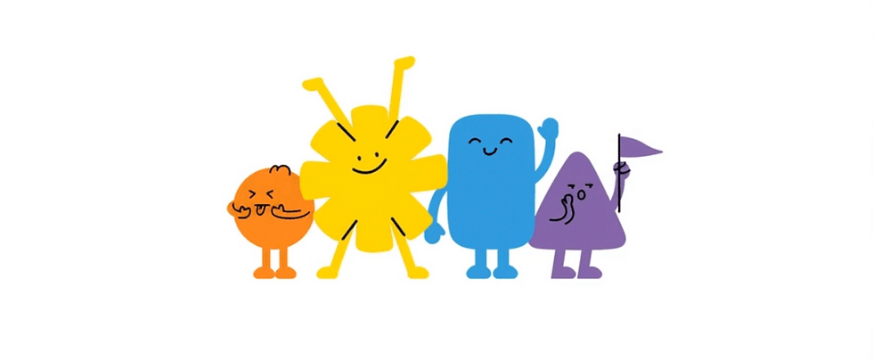
Ice cream cones have always been a childhood favorite, whether it's a reward after school or a treat on a sunny day, they hold a special place in every kid’s heart. Mini Cones by ACM set out to wrap that feeling of delight, not just through taste but through design. The goal was to create packaging that felt playful, expressive, and full of joy even before the first bite.
We built the brand around one simple idea: tiny bursts of joy wrapped in ice cream. The packaging had to feel like a treat even before it was opened. A bright, candy-inspired color palette sets the tone, with cheerful hues that instantly appeal to little eyes.
To bring out the emotion behind every bite, we introduced playful illustrations reflecting kids' real snack-time reactions, wide-eyed wonder, cheeky grins, and the pure joy of a cold treat on a sunny day. These expressive characters turn every pack into a moment of connection.


Add a Title
Add paragraph text. Click “Edit Text” to update the font, size and more.

Add a Title
Add paragraph text. Click “Edit Text” to update the font, size and more.
Add a Title
Add paragraph text. Click “Edit Text” to update the font, size and more.
Add a Title
Add paragraph text. Click “Edit Text” to update the font, size and more.