

.png)


BALAJI KHICHIYA PAPAD
2025
Strategy, Brand Identity,
Nomenclature, Positioning,
Packaging Design,
Typography & Illustrationy
A taste of home, now packed in a box by Balaji Wafers.
Balaji Wafers, a name that echoes in every Indian home, wasn’t looking to reinvent the wheel. They wanted to honour it. Balaji has always been about bringing familiar flavours to the forefront, across age groups and occasions.
Khichiya Papad, a crunchy companion to steaming khichdi, a sidekick in thalis, a standalone snack with a squeeze of lime, has always had a quiet place in our kitchens. But in this box, it gets a louder one.
Balaji Wafers wanted to take this humble side dish and give it a front-row seat. Something that could sit proudly on shelves, look as good as it tastes, and still carry the comfort of home.
The brief was simple, but layered: Create a design that resonates with the older generation, who grew up eating it hot off the pan. And with the younger one, discovering it between meals. It had to feel grown-up without being dull. Nostalgic, but not old-fashioned. Something that could sit proudly on a modern shelf and still feel like home.
Chacha chaudhary namkeen
2024
SHREE GIRRAJ FOOD PRODUCTS
(Uttar Pradesh, India)
Packaging Design, Illustration
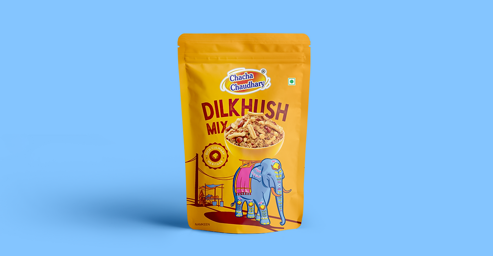
A Namkeen Journey Through the Heart of India
For Chacha Chaudhary’s namkeen range, we designed a packaging system inspired by the vibrancy of Indian markets. At the heart of it is a majestic elephant, adorned with rich Indian motifs, carrying a grand carriage of namkeen through a bustling bazaar. It’s a scene steeped in tradition, bursting with flavour, sound, and storytelling.
The illustration style mirrors the charm and chaos of Indian streets, colourful textiles, hand painted signs, and layered details bring the landscape to life. The elephant, a symbol of strength and festivity, becomes the unlikely hero of this flavourful journey, delivering spiced treasures with every step.
More than just packaging, this is a moving mural a tribute to how snacks are woven into our daily life, from festival stalls to family moments. Designed for shelf impact and easy line expansion, it feels like a parade of flavour that invites memory, celebration, and joy.
.png)
As seen across Indian culture, at festivals, in markets, and outside temples, the elephant brings with it a sense of celebration, pride, and familiarity.

.png)


On the elephant, these patterns appear as decorative motifs painted across its body, a nod to cultural rituals and ceremonial art, adding deeper meaning to the visual story.


.png)


Brought to life by
DIB Creative Studio & Shree Girraj Food Products
Project Credits
Concept & Creative Direction
Pankti Sheth, Disha Jani, Kushan Thakkar, Chirag Trivedi
Art Direction & Illustration
Chirag Trivedi & Disha jani
Project Operation & Management
Mitlesh Solanki
Client Collaboration
Sachin Agrawal (Director)
Pawan Mittal (Marketing Head)
Post Production
Sahil Bhojani
Add a Title
Add paragraph text. Click “Edit Text” to update the font, size and more.

Add a Title
Add paragraph text. Click “Edit Text” to update the font, size and more.
Add a Title
Add paragraph text. Click “Edit Text” to update the font, size and more.
Add a Title
Add paragraph text. Click “Edit Text” to update the font, size and more.