
BALAJI KHICHIYA PAPAD
2025
Strategy, Brand Identity,
Nomenclature, Positioning,
Packaging Design,
Typography & Illustrationy
A taste of home, now packed in a box by Balaji Wafers.
Balaji Wafers, a name that echoes in every Indian home, wasn’t looking to reinvent the wheel. They wanted to honour it. Balaji has always been about bringing familiar flavours to the forefront, across age groups and occasions.
Khichiya Papad, a crunchy companion to steaming khichdi, a sidekick in thalis, a standalone snack with a squeeze of lime, has always had a quiet place in our kitchens. But in this box, it gets a louder one.
Balaji Wafers wanted to take this humble side dish and give it a front-row seat. Something that could sit proudly on shelves, look as good as it tastes, and still carry the comfort of home.
The brief was simple, but layered: Create a design that resonates with the older generation, who grew up eating it hot off the pan. And with the younger one, discovering it between meals. It had to feel grown-up without being dull. Nostalgic, but not old-fashioned. Something that could sit proudly on a modern shelf and still feel like home.
Frylo
2022
Frylo Foods (Chhajed Foods Pvt. Ltd., now part of the La Gajjar Group)
(Gujarat, India)
Packaging Design, Nomenclature, Brand Identity, 3D, Illustration
Bringing Frylo from behind the scenes to the centre of the shelf.
Frylo had been around for decades, quietly doing the work behind the scenes. But it was time for the brand to take center stage. The new identity gives Frylo a distinct voice, playful, confident, and easy to spot. The hand-drawn logo adds personality, while the swoop under the “Y” brings just the right touch of energy and friendliness.
For Roundeez, the multigrain pellet range, we designed the packaging to be clear, eye-catching, and flexible. Whether it’s a masala pellet or a plain one, the layout stays consistent and easy to understand. Clear front-of-pack claims, vibrant product shots, and purposeful color choices help shoppers find their favorite in seconds. It’s a system built to grow with the brand, no matter how many new variants come in.
The refreshed system brings Frylo in line with how snacks are seen and bought today. Clear flavor cues, a consistent color system, and a confident visual identity make it easier for consumers to find, trust, and return to. It's a simple, focused update designed to work on shelf, in hand, and across digital platforms.

How do you reimagine a street snack with decades of love and almost no structure?
Frylo wasn't a new kid on the block. It had been around since 1979, quietly manufacturing snack pellets for over four decades. But for most of its life, it remained behind the scenes known within distribution and export circles, but invisible to everyday consumers.
That started to change in 2022. A new chapter began when the La Gajjar Group came onboard. With fresh backing and sharper business clarity, Frylo set its sights on something it hadn't actively pursued before: brand recall.

But the category wasn’t waiting around.
The Indian snacking aisle was already brimming with bright bags, loud logos, and legacy names. Consumers had too many choices. Retailers had limited shelf space.
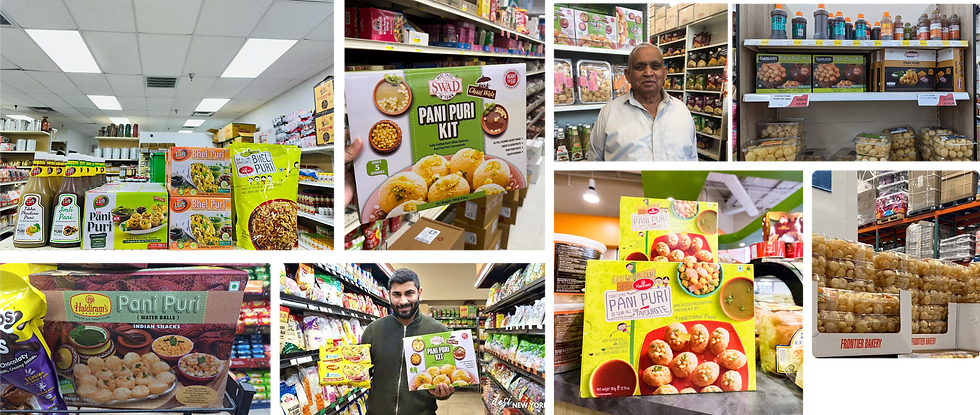
The Indian Pani Puri market is a large and rapidly growing sector, estimated to be worth over ₹6,000 crore. It's a significant part of the broader street food market, which is experiencing substantial expansion. The market is projected to reach ₹50,000 crores by 2024-2025.
Key trends shaping the shelf

HYGIENE IS A DIFFERENTIATOR

DIY KITS
ON THE RISE

DIGITAL-FIRST BEHAVIOUR
What's Driving It?
Urban hustle: Busy lifestyles have made ready-to-eat and DIY kits more appealing. People want convenience without losing cultural connection.
Middle-class shift: With rising incomes, the average consumer is more hygiene conscious, looking for trusted, branded options even when it comes to fun snacks.


Who are they?
They grew up eating chaats on street corners, and they still crave that explosion of flavour but now they want it without the gut guilt. They’re not chasing “fitness snacks” or 5% quinoa. They just want the same feel good food, made a bit smarter.
Juggling work, home, and maybe even a side hustle
No time to boil potatoes and make tamarind chutney from scratch
Feels guilty for eating junk, but isn't ready to give up on flavour
Might scroll for recipes on Instagram, but ultimately wants something that's ready in minutes
What they care about?
Taste first. Always. If it doesn’t hit the spot, it doesn’t matter how clean or healthy it is.
Hygiene they can see sealed packs, clear dates, ingredients they can pronounce.
Products that feel convenient, but not mass-produced. A homemade vibe is a big win.
Value for money “don’t give me a fancy jar of 8 puris and call it premium.” They’ll compare brands, flip the pouch over, and check the contents before committing.
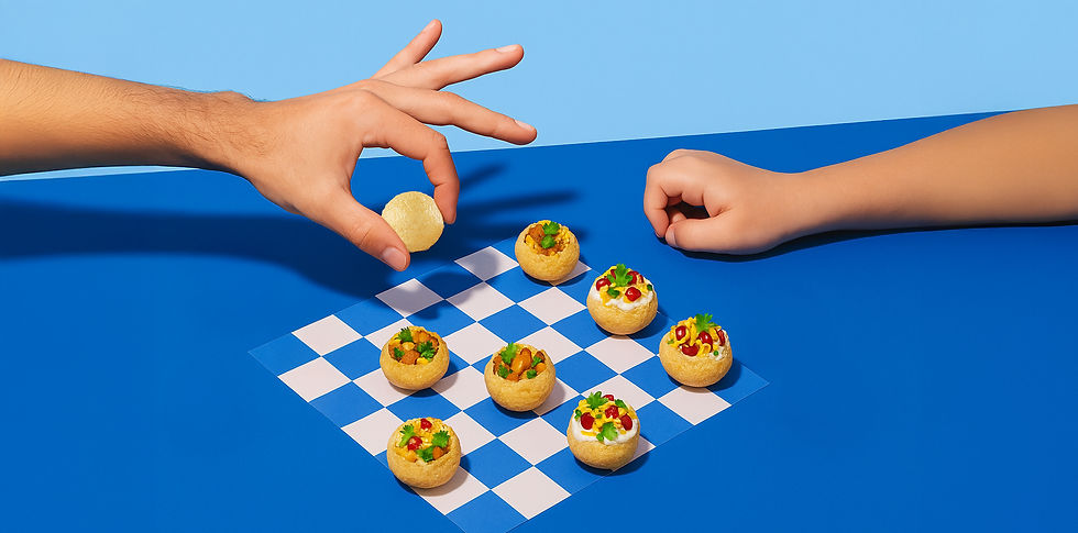
If the product is light, crisp, and full of joy
why shouldn’t the brand feel the same?


We built the logo to mirror what Frylo sells: crunchy roundness and joyful familiarity.
A type structure that is a rounded terminals. Confident curves. Nothing too ornamental just bold enough to be seen, and soft enough to be loved.


Brought to life by
DIB Creative Studio & Frylo Foods
Project Credits
Concept & Creative Direction
Pankti Sheth, Disha Jani, Chirag Trivedi, Nikunj Amrutia
Art Direction
Pankti Sheth
Packaging System Design
Disha Jani
Identity System Design
Chirag Trivedi
Project Operation & Management
Mitlesh Solanki
Client Collaboration
Varun Gajjar (Director)
Post Production
Sahil Bhojani
Add a Title
Add paragraph text. Click “Edit Text” to update the font, size and more.

Add a Title
Add paragraph text. Click “Edit Text” to update the font, size and more.

Add a Title
Add paragraph text. Click “Edit Text” to update the font, size and more.

Add a Title
Add paragraph text. Click “Edit Text” to update the font, size and more.


