

BALAJI KHICHIYA PAPAD
2025
Strategy, Brand Identity,
Nomenclature, Positioning,
Packaging Design,
Typography & Illustrationy
A taste of home, now packed in a box by Balaji Wafers.
Balaji Wafers, a name that echoes in every Indian home, wasn’t looking to reinvent the wheel. They wanted to honour it. Balaji has always been about bringing familiar flavours to the forefront, across age groups and occasions.
Khichiya Papad, a crunchy companion to steaming khichdi, a sidekick in thalis, a standalone snack with a squeeze of lime, has always had a quiet place in our kitchens. But in this box, it gets a louder one.
Balaji Wafers wanted to take this humble side dish and give it a front-row seat. Something that could sit proudly on shelves, look as good as it tastes, and still carry the comfort of home.
The brief was simple, but layered: Create a design that resonates with the older generation, who grew up eating it hot off the pan. And with the younger one, discovering it between meals. It had to feel grown-up without being dull. Nostalgic, but not old-fashioned. Something that could sit proudly on a modern shelf and still feel like home.
Waghbakri Mili Elaichi Tea
2024
Gujarat Tea Processors and Packers Limited
(Gujarat, India)
Packaging Design
Recognition comes first. Character comes next.
Elaichi tea already comes with expectations. People look for green. They look for cardamom. Those familiar cues help them recognise the flavour long before they read the pack. Ignoring them would make the product harder to find. Following them too closely would make it disappear into everything else.
The question became:
How do you give a familiar flavour its own character while keeping it instantly recognisable?
Mili already had a visual language of its own. The new flavour needed to belong to that family first, while still feeling unmistakably like Elaichi.
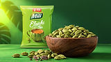
One thing stood out. For tea brands, especially Wagh Bakri, the cup isn't simply an illustration. It's one of the strongest recognition assets on the pack. People often recognise the product by the cup before anything else. So instead of treating cardamom as decoration around the cup, we made it part of the cup itself. The silhouette took inspiration from the form of a cardamom pod, allowing the flavour to become part of the object rather than an element placed beside it. The result feels familiar without feeling generic. It looks like Elaichi tea. It still feels like Mili. And it sits naturally within the larger Wagh Bakri portfolio.



Brought to life by
DIB Creative Studio &
Gujarat Tea Processors and Packers Limited
Project Credits
Concept & Creative Direction
Pankti Sheth
Art Direction
Dhavanshi Shah
Project Operation & Management
Mitlesh Solanki
Client Collaboration
Yogesh Shinde (Sr. VP Marketing)
Mausam Singh Khera (Marketing Manager)
Add a Title
Add paragraph text. Click “Edit Text” to update the font, size and more.

Add a Title
Add paragraph text. Click “Edit Text” to update the font, size and more.
Add a Title
Add paragraph text. Click “Edit Text” to update the font, size and more.
Add a Title
Add paragraph text. Click “Edit Text” to update the font, size and more.