
BALAJI KHICHIYA PAPAD
2025
Strategy, Brand Identity,
Nomenclature, Positioning,
Packaging Design,
Typography & Illustrationy
A taste of home, now packed in a box by Balaji Wafers.
Balaji Wafers, a name that echoes in every Indian home, wasn’t looking to reinvent the wheel. They wanted to honour it. Balaji has always been about bringing familiar flavours to the forefront, across age groups and occasions.
Khichiya Papad, a crunchy companion to steaming khichdi, a sidekick in thalis, a standalone snack with a squeeze of lime, has always had a quiet place in our kitchens. But in this box, it gets a louder one.
Balaji Wafers wanted to take this humble side dish and give it a front-row seat. Something that could sit proudly on shelves, look as good as it tastes, and still carry the comfort of home.
The brief was simple, but layered: Create a design that resonates with the older generation, who grew up eating it hot off the pan. And with the younger one, discovering it between meals. It had to feel grown-up without being dull. Nostalgic, but not old-fashioned. Something that could sit proudly on a modern shelf and still feel like home.
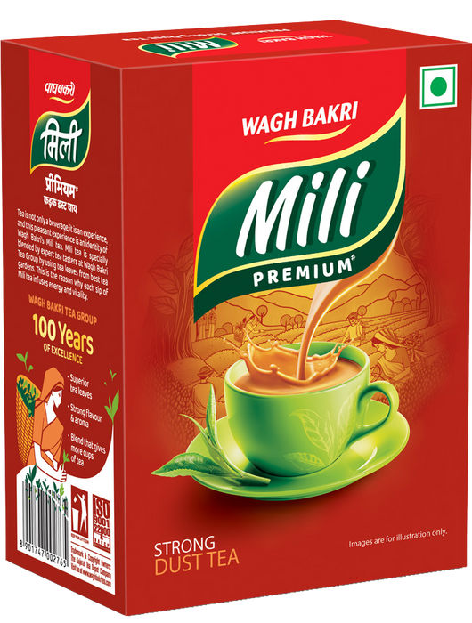
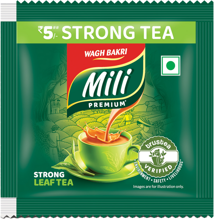
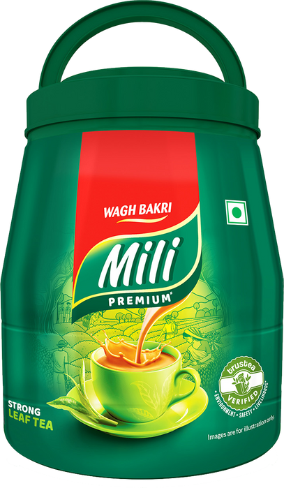
Mili Premium tea
2023
Gujarat Tea Processors and Packers Limited
(Gujrat, India)
Identity Refresh, Packaging Design,
Illustration
You don’t just drink Wagh Bakri. You grow up with it.
Wagh Bakri isn’t just a name on a tea packet, it’s the clink of a steel spoon against a glass tumbler. The gentle steam curling through sleepy kitchens. The comforting chaos of a chai tapri on a busy street. It’s not just tea. It’s the feeling of coming home.
What began in 1892, when Narandas Desai returned from South Africa with a certificate from Mahatma Gandhi, has since grown into India’s third-largest packaged tea company. But beyond the legacy and the milestones, what truly stands out is the emotional weight Wagh Bakri carries. It’s not defined by numbers. It’s defined by moments. By the way people reach for it instinctively, like a habit of the heart.
Over generations, Wagh Bakri has built something rare trust that’s brewed slowly, consistently. Warm. Familiar. Steady. And in a world constantly chasing the new, there’s something deeply grounding about that. Because sometimes, the most powerful brands aren’t the loudest. They’re the ones that feel like family.

India’s Market Study
India's tea market is a vibrant mix of tradition and transformation. As the second-largest tea producer in the world, it thrives on both unorganized local vendors and a steadily growing segment of organized players. While the streets still buzz with the charm of chaiwalas serving steaming cups, branded tea has made its mark, driven by urbanization,evolving lifestyles, and rising health consciousness. Catering to a diverse audience from budget-conscious householdsto those seeking premium blends the market thrives on trust, quality, and innovation. Brands continually balance heritage with modernity to meet the ever-growing and varied demands of Indian tea lovers.


A Nation
Built on Chai
In India, tea is never just tea.
It’s a ritual, a rhythm, and
a shared pause.
Found in roadside kulhads and stainless steel tumblers, served with glucose biscuits or over long gossips, it’s a drink that dissolves barriers between strangers, between moments, between worlds. It’s how we begin the day, how we greet guests, how we make memories. And in this landscape of tea, Mili holds a quiet but powerful place. It doesn’t claim luxury or demand attention. It’s the tea that simply shows up consistently, comfortingly, across generations.
But to keep walking through this evolving world to remain relevant in modern kitchens and mindful lives, Mili needed a language that matched its heart.
And so to bring that feeling to life, we turned the comfort of chai into a design language; rooted in care, connection, and origin.
CARE

THE BRAND
LOOK
nature framed
CONNECTION

THE TEA CUP
MOVEMENT
sip by sip
ORIGIN

THE TEA GARDEN
CONNECTION
rooted in freshness


Step #01
The type takes shape,
clean, flowing, and easy to read.

Step #02
The leaf comes in,
simple, familiar, & rooted in freshness.

Step #03
An outline is added,
just enough to make the trust shine.


From Concept to Clarity
What began as a concept stage photograph was refined through controlled lighting, styling precision, and post-production detailing to achieve a visual that’s print-ready for gravure and offset, and crisp enough for digital platforms. The warmth stayed. The clarity got sharper.


Boring Barcode? Nope.
Barcodes are often functional afterthoughts, but on Mili’s packaging, even this detail becomes a moment of connection. Designed to resemble a cluster of tea leaves, the barcode reflects the brand’s thoughtfulness and commitment to its purpose.It embodies Mili’s dedication to integrating every element, no matter how small, into its story of authenticity and care.


Brought to life by
DIB Creative Studio &
Gujarat Tea Processors and Packers Limited
Project Credits
Concept & Creative Direction
Pankti Sheth, Dhavanshi Shah, Richa Bhavsar, Sahil Bhojani
Identity System Design & Art Direction
Dhavanshi Shah
Image Recreation
Sahil Bhojani
Project Operation & Management
Mitlesh Solanki
Client Collaboration
Yogesh Shinde (Sr. VP Marketing)
Mausam Singh Khera (Marketing Manager)
Illustration
Dhavanshi Shah
Post Production
Sahil Bhojani
Motion Graphics
Priyal Vora
Add a Title
Add paragraph text. Click “Edit Text” to update the font, size and more.

Add a Title
Add paragraph text. Click “Edit Text” to update the font, size and more.

Add a Title
Add paragraph text. Click “Edit Text” to update the font, size and more.

Add a Title
Add paragraph text. Click “Edit Text” to update the font, size and more.


