

We’re a home for ideas with heart; designing loudly, thinking deeply, and living for the goosebumps.
Because building brands that stay with people takes more than design, it takes care and craft, humans who make it matter, and a place for new voices to grow.


BALAJI KHICHIYA PAPAD
2025
Strategy, Brand Identity,
Nomenclature, Positioning,
Packaging Design,
Typography & Illustrationy
A taste of home, now packed in a box by Balaji Wafers.
Balaji Wafers, a name that echoes in every Indian home, wasn’t looking to reinvent the wheel. They wanted to honour it. Balaji has always been about bringing familiar flavours to the forefront, across age groups and occasions.
Khichiya Papad, a crunchy companion to steaming khichdi, a sidekick in thalis, a standalone snack with a squeeze of lime, has always had a quiet place in our kitchens. But in this box, it gets a louder one.
Balaji Wafers wanted to take this humble side dish and give it a front-row seat. Something that could sit proudly on shelves, look as good as it tastes, and still carry the comfort of home.
The brief was simple, but layered: Create a design that resonates with the older generation, who grew up eating it hot off the pan. And with the younger one, discovering it between meals. It had to feel grown-up without being dull. Nostalgic, but not old-fashioned. Something that could sit proudly on a modern shelf and still feel like home.
JEERI
2026
SOFAS - Société de Fabrication des Sénégal
(Senegal, Africa)
Brand Identity, Packaging Design, Illustration
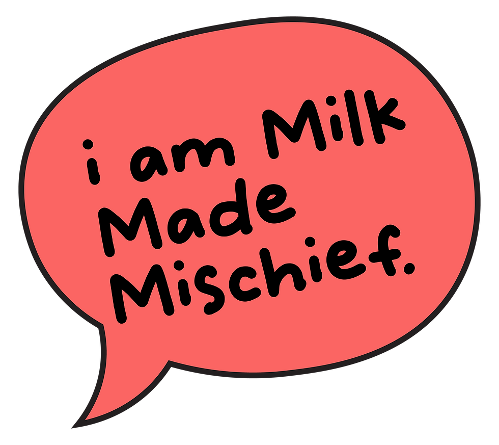
When a Dairy Brand Decides to Have a Personality.
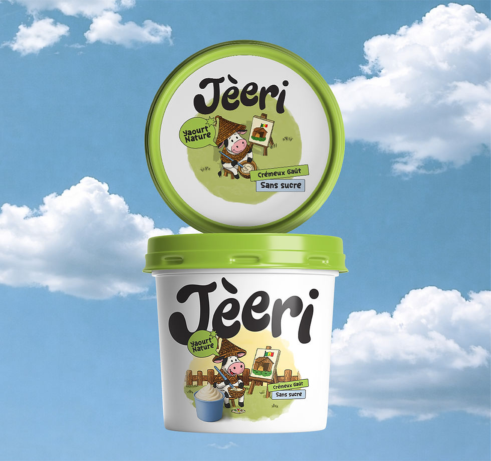
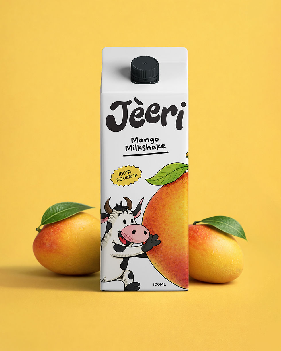
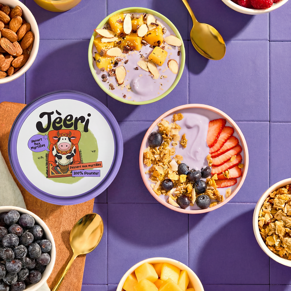
Most dairy packaging plays it safe. Clean whites, a product shot, done. The category has looked roughly the same for decades, and most brands seem fine with that. Jèeri, a Senegal-based dairy brand, wasn't. They came to De Icebreaker with one clear belief: everyday products deserve more than functional packaging. So instead of starting with the products, we started with a character, a joyful Senegalese cow named Jèeri, who became the emotional core of the entire brand identity system.
Jèeri wasn't designed as a traditional mascot. He has a full inner world: morning yoga routines, slow afternoons with farm friends, a philosophy built around mindfulness and small everyday joys. That personality became the brand language. Each product in the range carries its own illustration, its own slice of Jèeri's universe, while still reading as part of the same FMCG packaging family. The system gives the range instant coherence on shelf without making every pack feel identical.
The design decisions follow from the character. A bright, warm colour palette, different for each product, creates immediate shelf visibility without relying on noise. Illustration does the heavier lifting, replacing generic dairy symbolism with scenes that actually tell a story. Typography and composition stay grounded so the character work has room to breathe. The result is packaging that feels alive rather than assembled, which is a harder balance to land in FMCG packaging design than it looks.
What makes the system work is what it doesn't do. It doesn't shout. It doesn't lean on appetite photography or predictable category cues. It builds familiarity the slower way, through character, through storytelling, through a visual world people want to return to. Playful without becoming childish. Expressive without losing clarity. For a brand trying to connect with a younger, visually literate audience, that balance is the whole point.


.jpg)


Brought to life by
DIB Creative Studio & Sofas
Project Credits
Concept & Creative Direction
Pankti Sheth, Nisarg Bhavsar, Dhavanshi Shah
Art Direction
Nisarg Bhavsar
Packaging & Illustration System Design
Nisarg Bhavsar
Post Production
Chirag Trivedi
Project Operation & Management
Mitlesh Solanki
Client Collaboration
Abhishek Shinde (Brand Manager)
Add a Title
Add paragraph text. Click “Edit Text” to update the font, size and more.

Add a Title
Add paragraph text. Click “Edit Text” to update the font, size and more.
Add a Title
Add paragraph text. Click “Edit Text” to update the font, size and more.
Add a Title
Add paragraph text. Click “Edit Text” to update the font, size and more.