
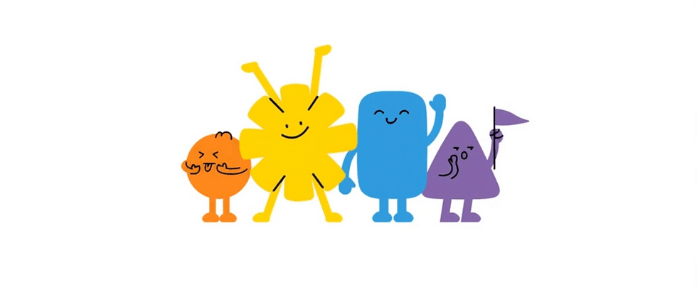
We’re a home for ideas with heart; designing loudly, thinking deeply, and living for the goosebumps.
Because building brands that stay with people takes more than design, it takes care and craft, humans who make it matter, and a place for new voices to grow.

BALAJI KHICHIYA PAPAD
2025
Strategy, Brand Identity,
Nomenclature, Positioning,
Packaging Design,
Typography & Illustrationy
A taste of home, now packed in a box by Balaji Wafers.
Balaji Wafers, a name that echoes in every Indian home, wasn’t looking to reinvent the wheel. They wanted to honour it. Balaji has always been about bringing familiar flavours to the forefront, across age groups and occasions.
Khichiya Papad, a crunchy companion to steaming khichdi, a sidekick in thalis, a standalone snack with a squeeze of lime, has always had a quiet place in our kitchens. But in this box, it gets a louder one.
Balaji Wafers wanted to take this humble side dish and give it a front-row seat. Something that could sit proudly on shelves, look as good as it tastes, and still carry the comfort of home.
The brief was simple, but layered: Create a design that resonates with the older generation, who grew up eating it hot off the pan. And with the younger one, discovering it between meals. It had to feel grown-up without being dull. Nostalgic, but not old-fashioned. Something that could sit proudly on a modern shelf and still feel like home.
Revolt Energy
2023
Revolt Beverages
La Gajjar Consumer Products LLP (La-Gajjar Group)
(Ahmedabad, India)
Packaging Design, Illustration
Where rebellion takes shape; visually, loudly, and unapologetically.
Revolt was never meant to be polite. It was made to cut through a voice for India’s restless youth who are tired of being filtered down. The identity had to channel that rawness. We designed a logo that felt like a jolt: angular, edgy, built to move. Each letter looks like it’s been carved mid-motion. No perfect lines, no calm edges just pure, kinetic energy.
But energy alone isn’t enough. We paired it with language literal, local, loud. The wordmark flexes easily across categories, backed by a tone that talks the way our consumers do: direct, desi, and slightly defiant. This gave Revolt a personality that feels like your most expressive friend unfiltered and always on.
And then came the beasts.
For the energy drink, we turned rebellion into something you could see and want to collect. Each can features a creature mid-charge, drawn from cultural cues of power: the leopard, the bull, the panther. Their eyes lock on. The background crackles. And the mood? Unmistakably amped. The result is a lineup that breaks the shelf and builds instant recall because in a category driven by impulse, it’s not just about being seen. It’s about being remembered.
What we saw
Younger India doesn’t need energy. It embodies it. Especially in Tier 2 and 3 towns, where gym-bros, gamer squads, dancers, hustlers, and hostelers are all building their own rhythm, their own version of what ambition looks like. They’re not waiting for permission. They’re just... on.

But the shelf
didn’t feel like them.
Everything looked like fever dream or a generic soda with a bad attitude.
So we made something that looked like it belonged in their hands. Something that didn’t just give you energy. It felt like it knew you had some to begin with.


REVOLT
ENERGY DRINKS
INSTINCT BOTTLED.
Revolt's energy drink line extends the brand's rebellious spirit into a
high-voltage format building a bold visual and emotional system
rooted in instinctive energy.
This isn't manufactured hype, It's energy that feels lived-in.
Raw. Unfiltered. Unstaged.
Each variant is powered by a distinct animal archetype chosen to reflect
a unique energy signature: a behaviour, a mindset, a way Of showing up.


NOW PLAYING:
REVOLT ENERGY.
Each animal means more than a flavour. It carries a mood, a mindset, a moment of power.
We designed a system that's:
-
Instinctive, not over-explained
-
Visually bold emotionally driven
-
Built for quick recall and long term loyalty
A system that doesn't need explanation.
Just one look and you know exactly what kind of power you're picking up.


Brought to life by
DIB Creative Studio & Revolt Beverages
La Gajjar Consumer Products LLP (La-Gajjar Group)
Project Credits
Concept & Creative Direction
Pankti Sheth, Dhavnshi Shah, Chirag Trivedi, Shaiva Bhatt
Art Direction
Dhavanshi Shah
Project Operation & Management
Kareena Patel
Client Collaboration
Devdutta Sa (Marketing Manager, La-Gajjar Group)
Illustration
Dhavanshi Shah
Identity System Design
Chirag Trivedi
Motion Graphics
Chirag trivedi
Add a Title
Add paragraph text. Click “Edit Text” to update the font, size and more.

Add a Title
Add paragraph text. Click “Edit Text” to update the font, size and more.
Add a Title
Add paragraph text. Click “Edit Text” to update the font, size and more.
Add a Title
Add paragraph text. Click “Edit Text” to update the font, size and more.