
PACK’ACE’ DESIGNING? WE HAVE AN AWARD FOR THAT!
- DIB STUDIO

- Nov 10, 2021
- 3 min read
DIB BAGS ITS SECOND BEST DESIGN PROJECT AWARD!

We are super thrilled to announce that we have won India's Best Design Project at India's Best Design Awards 2021 by Indi Design India!
Nothing feels better than the acknowledgment one gets for hard work. This award was exactly what our team required to hustle more and bustle with double the energy and creativity. We are super proud of ourselves and rightly so!
While the world was hustling with a deadly virus on the prowl, we decided to take solace in design. So, when the world was in the constant phase of uncertainty and adversity, we decided to unleash creativity.
Miraj Group India approached us to change their brand language for the better. In a swamp of cluttered and unappealing snack packs, they wanted their products to shine in the aisle. As a project that had just begun, with the pandemic, it became really hard to coordinate and concentrate. But as they say, 'When the going gets tough, the tough gets going'!
With this mantra in our heads, we started to brainstorm.
The challenges that came with the old packaging were that it lacked: brand positioning, necessary information, product shots, composition, and most important: brand language. The packaging wasn’t striking enough for a customer to successfully notice it let alone buy.
Our idea was to bring out the essence of each product to attract the consumer.
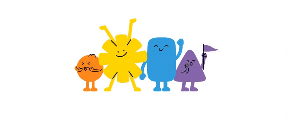
While brainstorming we hit upon a jackpot of an idea! How about a mascot or a character that directly interprets the origin of the flavour? It would fasten the engagement with the consumer and create the exact amount of buzz around the product.
The process that followed was that we decided to give the product line a name, which was missing before. We wanted to name it something that had a strong recall and would linger on people’s mouths for long. We wanted something short, snacky and, enticing.
Hence the name ‘KHATACK’ popped into our head. The name symbolized the sound that comes when we happily munch on our favourite snacks. “Fatak se kholo, KHATACK se khalo” became the slogan basis of our design idea.
During the execution phase, we experimented with a lot of different angles and colours to define the brand in the best possible way. We decided to use various colours to flaunt the flavours and give our packs some real shelf-shout.
We shortlisted characters based on the flavours and its key ingredients because snacks basically lure one with flavour sensations.
To add some tangy ting to the idea, we created replicas of characters based on the source of their origin. The shots were then made to showcase a balance between the products and their ingredients.

As an end result, we came up with a design range for the products which was well considered and had the content hierarchy spot on. Our packs had a very linear structure to the layout which made it easy to visually digest with the right amount of content and colour.
It was not just us in the studio who toiled hard for this packaging to shine. It was also a few people with whom we collaborated for photoshoots and other related tasks. We would like to extend our special thanks to Mr. Ruben Singh, the photographer, and Ms. Aarti Fedane, the food stylist. Without these people, Miraj Khatack wouldn’t have turned up to the beauty it is today!
We would also like to thank everyone who supported us throughout this journey. You were like the invisible anchor to the ship of our creativity. Your support meant the world to us. Thank you!
This award is the second one of many yet to come! We would like to ask the world of design to look out for us, as there's more to come and BECAUSE WE HAVE JUST STARTED!


Comments